.webp)
.svg)
Program overview


Online
On-site
Hybrid
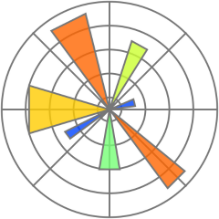
Data Visualization with Matplotlib & Seaborn
Build a strong foundation in data visualization using Python by mastering Matplotlib and Seaborn for exploratory and analytical insights. Learn how to create customized, time series, and interactive visualizations using real world datasets to effectively analyze patterns and communicate insights.
Duration:
5 days
Level:
Intermediate

.avif)
1500+ users onboarded
Who will Benefit from this Training?
- Data Analysts
- Data Scientists
- Business Analysts
- Data Engineers
- IT Professionals
- Anyone Interested in Data Visualization
Training Objectives
- Understand the importance of data visualization and its role in the data analysis process.
- Gain proficiency in using Matplotlib to create a wide range of static and interactive visualizations.
- Learn to utilize Seaborn to create visually appealing statistical graphics with less code.
- Discover advanced customization techniques for both Matplotlib and Seaborn.
- Explore how data visualization can facilitate data analysis and insight generation.
- Understand the specific challenges of visualizing time-series data and learn to create effective line plots, area plots, and heatmaps to analyze temporal trends and patterns.
- Explore interactive data visualization using libraries like Plotly and Seaborn.
- Apply the learned skills to real-world datasets and tackle practical data visualization challenges.
Build a high-performing, job-ready tech team.
Personalise your team’s upskilling roadmap and design a befitting, hands-on training program with Uptut

Key training modules
Comprehensive, hands-on modules designed to take you from basics to advanced concepts
- Introduction to Data Visualization
- Understanding the significance of data visualization and its impact on business decision-making.
- Matplotlib Basics
- Learning the essentials of Matplotlib, a powerful Python library for creating diverse visualizations.
- Line Plots
- Creating and customizing line plots to visualize trends and patterns in data.
- Scatter Plots
- Utilizing scatter plots to identify relationships and correlations between variables.
- Bar Plots
- Visualizing categorical data with bar plots for comparisons and distributions.
- Histograms
- Analyzing data distributions and frequency with histograms for numerical variables.
- Pie Charts
- Representing proportions and percentages using pie charts for categorical data.
- Customizing Plots
- Enhancing visualizations with labels, legends, colors, and styles for effective communication.
- Subplots and Grids
- Creating multiple plots within a single figure for better data organization.
- 3D Plots
- Visualizing three-dimensional data to gain insights from multi-dimensional datasets.
- Seaborn Introduction
- Introduction to Seaborn, a higher-level data visualization library that complements Matplotlib.
- Distribution Plots
- Creating various distribution plots for in-depth data exploration.
- ]Pair Plots
- Visualizing pairwise relationships between multiple variables for quick insights.
- Categorical Plots
- Using Seaborn to visualize categorical data for effective comparisons.
- Regression Plots
- Understanding and visualizing linear relationships between variables.
- Heatmaps
- Representing data with color gradients to identify patterns and trends.
- Time-Series Plots
- Visualizing time-series data to analyze temporal patterns and changes.
- Styling Seaborn Plots
- Customizing Seaborn visualizations for a polished and professional look.
- Interactive Visualization with Plotly
- Creating interactive plots for dynamic data exploration and storytelling.
- Real-World Data Visualization Projects
- Applying learned techniques to real-world datasets to derive meaningful insights for business applications.
- Data Storytelling
- Learning the art of data storytelling to effectively communicate insights to stakeholders.
- Best Practices in Data Visualization
- Understanding key principles and best practices to create impactful visualizations.
- Collaborative Data Visualization
- Team collaboration to work on group projects and foster a data-driven culture within the organization.
- Dashboard Creation
- Building comprehensive dashboards for data analysis and presentation.
- Practical Applications and Use Cases
- Exploring practical business scenarios where data visualization can drive informed decision-making.
Hands-on Experience with Tools
No items found.
No items found.
No items found.
Training Delivery Format
Flexible, comprehensive training designed to fit your schedule and learning preferences

Opt-in Certifications
AWS, Scrum.org, DASA & more
.avif)
100% Live
on-site/online training
.avif)
Hands-on
Labs and capstone projects
.avif)
Lifetime Access
to training material and sessions
Skill-Gap Assessment
Analysing skill gap and assessing business requirements to craft a unique program
1
Personalisation
Customising curriculum and projects to prepare your team for challenges within your industry
2
Implementation
Supplementing training with consulting support to ensure implementation in real projects
3
Why Data Visualization and Analysis with Python Libraries- Matplotlib & Seaborn for Your Business?
- Enhanced Decision Making: With Matplotlib & Seaborn, you can create intuitive charts and graphs that empower decision-makers to quickly extract valuable insights from data. This, in turn, facilitates data-driven decision-making.
- Exploratory Data Analysis: Data visualization with Matplotlib & Seaborn provides an excellent platform for exploratory data analysis (EDA). EDA allows you to interactively explore datasets, identify relationships between variables, and uncover hidden patterns.
- Efficient Reporting: Automated data visualization can streamline the reporting process, saving valuable time for your team and allowing them to focus on analysis and strategic actions.
.avif)
Lead the Digital Landscape with Cutting-Edge Tech and In-House " Techsperts "
Discover the power of digital transformation with train-to-deliver programs from Uptut's experts. Backed by 50,000+ professionals across the world's leading tech innovators.
.svg)
.svg)
.svg)
.svg)
.svg)
Recommended Training
Continue your learning journey with these hand-picked courses and bundles


Frequently Asked Questions
2. Will my team get any practical experience with this training?
.svg)
With our focus on experiential learning, we have made the training as hands-on as possible with assignments, quizzes and capstone projects, and a lab where trainees will learn by doing tasks live.
3. What is your mode of delivery - online or on-site?
We conduct both online and on-site training sessions. You can choose any according to the convenience of your team.
4. Will trainees get certified?
Yes, all trainees will get certificates issued by Uptut under the guidance of industry experts.
5. What do we do if we need further support after the training?
We have an incredible team of mentors that are available for consultations in case your team needs further assistance. Our experienced team of mentors is ready to guide your team and resolve their queries to utilize the training in the best possible way. Just book a consultation to get support.